Purple is an online mattress company known for two things: a unique mattress technology, and hilariously weird advertising like this.
Unfortunately, while their video marketing was a step above their industry, much of their digital was a mess. In particular, their emails.
I was hired by an advertising client to completely rewrite all of the company’s email flows with another designer in order to make them more interesting, more humorous, and more effective. It was part of a mini-rebranding the new head of marketing was doing, and the initial welcome email flows needed to be done within 2 weeks.
STEP 1: Creating a New Look and Feel
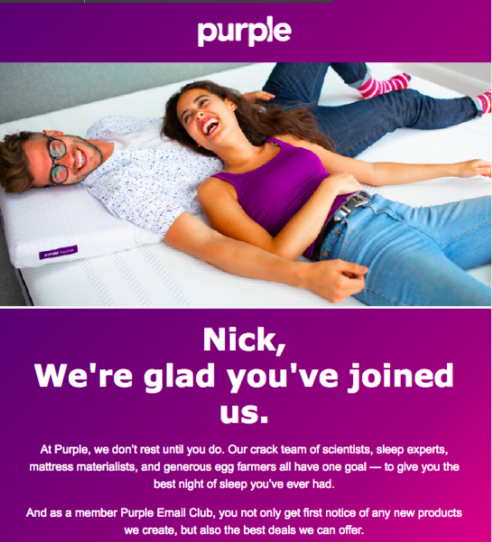
The most immediate issue with Purple’s emails? They were ugly. You can see an example of one of their previous emails on the right. Not only was the layout and coloration ugly, most of the emails read as giant blocks of text, and would clearly need be be massively rethought in order to drive up their per order rate.
I worked with the designer on a new layout that would allow us to do more in terms of graphics, illustrations, and other media, while also making for a much more readable email series. Once the template was designed, we moved onto the actual welcome flow.
STEP 2: Overhauling the Welcome Flow
The next issue with their emails was the fact that the flow of them—email to email—was poor. The first three emails in the chain were information heavy, with offers really only coming in at the start of the fourth, and by then, many potential customers had dropped out of the chain. I reworked the flow so that every email was shorter, had offers in place at the very start, and only built up from there.
STEP 3: Creating a New Tone
The majority of Purple’s advertising was always fun and lighthearted, but their emails were not. Part of my job was bringing over the rest of the brand’s tone into the emails, without it veering into parody. I did many drafts to get the language right, and also gave multiple versions from sillier to more serious so that they could be tested for which actually increased sales. Eventually, we settled on a mixed tone, where some emails were more humorous, and some were more informative.
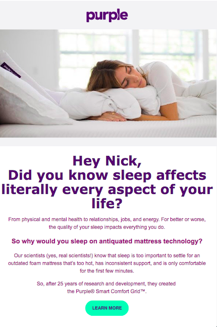
You can see clips of a few of the finalized emails below. Click on either image to view the entire email.


